reading-notes
Read 08 in 201
From the Duckett HTML book:
- HTML/CSS book, Ch. 15, “Layout”
- When you use relative, fixed, or absolute positioning, boxes can overlap
- The float property allows you to take an element in normal flow and place it as far to the left or right of the containing element as possible
- The clear property allows you to say that no element (within the same containing element) should touch the left or righthand sides of a box.
- Resolution refers to the number of dots a screen shows per inch.
- Because screen sizes and display resolutions vary so much, web designers often try to create pages of around 960-1000 pixels wide (since most users will be able to see designs this wide on their screens).
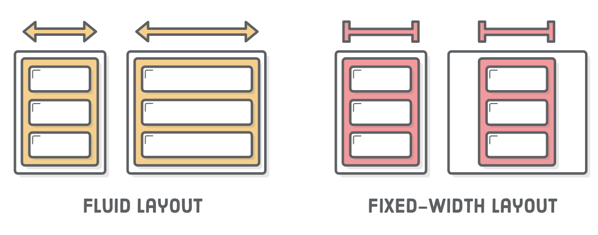
- Fixed width layout designs do not change size as the user increases or decreases the size of their browser window. Measurements tend to be given in pixels.
- Liquid layout designs stretch and contract as the user increases or decreases the size of their browser window. They tend to use percentages.
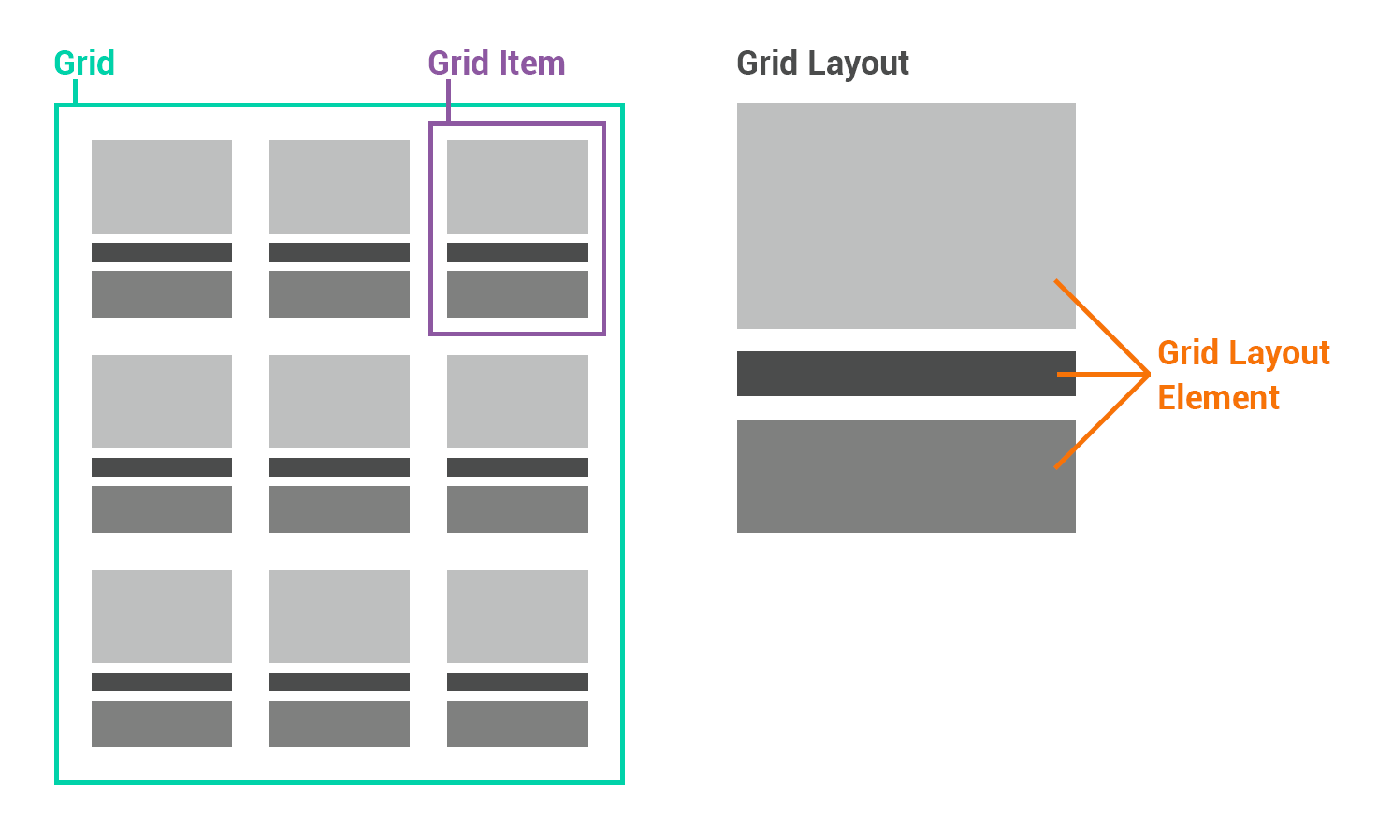
- Grids help create professional and flexible designs
- There are two ways to add multiple style sheets to a page:
- Your HTML page can link to one style sheet and that stylesheet can use the @import rule to import other style sheets.
- In the HTML you can use a separate element for each style sheet.
- You can include multiple CSS files in one page